Welcome to the NEW Physica Energetics website

Tour the Website here

The BIG Reveal!

The BIG Reveal!

New Physica Energetics Branding and Logo

In 2007, when Dr. Cass opened the doors of Physica Energetics in Canada, he handled everything from formulations to our labels, logo, and bottle types for the remedies. Yes, he chose the blue bottle we are well-known for and still use today. He was back then, and still is, a true trailblazer in the healing arts space with his remedies, products, and approach to health. I joined my dad by opening our US office in 2010. The demand from our US doctors and practitioners was growing. To keep up, having offices on either side of the border led to easier ordering and operations that continued to grow. 

Back in 2010, I was a one-woman show! I answered phones, packed boxes, shipped out orders, and even had my kids, 11 and 8 years old, help me after I had picked them up from school. 

As Dr. Cass became better known within the supplement industry to colleagues like yourself, word spread fast of my dad's formulations as they realized they were in another realm of effectiveness and healing potential. Practitioners sharing their stories and remedies with colleagues led the company to grow at a rate we could not have foreseen. 

Dr. Cass did a lot of our marketing, driving the company forward with his formulations, holding education seminars like the Academy back in 2007-2019 and the well-attended Concordia long weekend conferences, where we could come together and learn, connect, and grow. 

As Dr. Cass is moving into retirement (as mentioned in the introduction email to Lianne, our Director of Marketing and Communications), he continues to formulate new products at a furious rate, and has taken a step back from operations and marketing. 

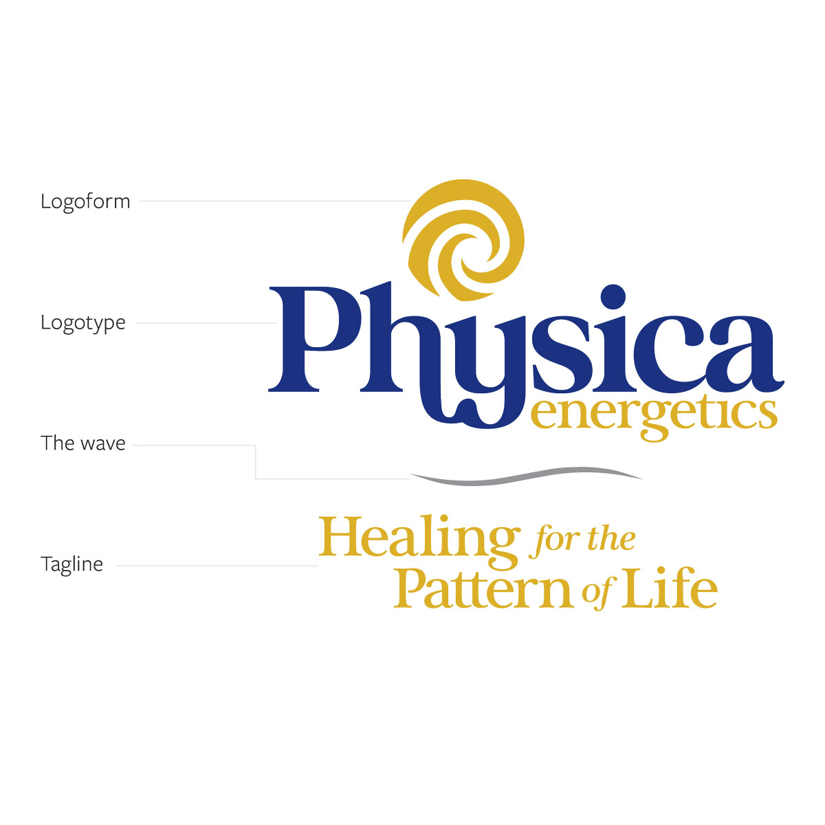
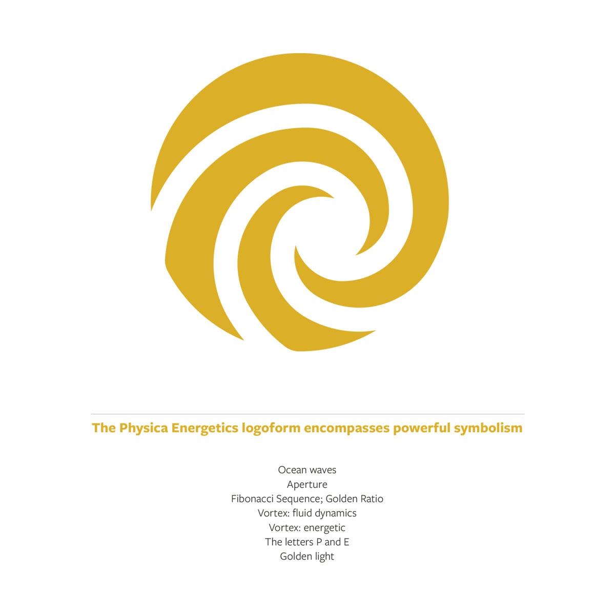
Our growing team is moving the company forward, and in line with Lianne’s strategy, that includes our corporate brand identity.

OUR NEW BRANDING

First, it’s still us

Taking on a new corporate identity can often be mistaken that a company has been bought out or taken over. Rest assureed that the Cass family is still at the helm, in charge, thriving and that will not change.

Time to evolve

We love our current logo and identity; however, it is time for an updated look and feel of the Physica Energetics branding to reflect our evolution. We have been through an in depth corporate identity rebranding process and are thrilled to reveal our new logo and branding to you.

Here it is... the NEW Physica Energetics logo!

Physica-energetics-logo-big-reveal

The Process

If you have been through the process of creating your own brand identity, the level of consideration and design interpretation was eye-opening for us. 

HotHouse Creative Inc. (HHC) was chosen to develop the next iteration of Physica Energetics’ branding. The outward-facing graphics had to ultimately represent the company’s ethos, character, and culture. 

Working with Paul Reid from HHC, his process started with interviews with Dr. Cass, Founder and Master Formulator, Crystal Cass, Executive Vice President, and myself, CEO and President. He captured our essence and interpreted what he learned about us into our new branding. If you have heard Dr. Cass speak, you know how impactful his intentions are, and that came through strong as ever during his discussion with Paul. 

Paul shared this with us about his experience on this project:
During an interview with parent company Aperture Energetics’ Director of Marketing and Communications, Lianne Phillipson, it was determined that we take a deeply thoughtful perspective from the business owners. 

Two daughters, Crystal and Julia, and their father, Dr. Robert Cass, were asked to explore the definition of their enterprise and the impressive ripple effect their products have created for over 20 years. It was clear through interviews with all three of them that there is an enormous respect for the formulations Dr. Cass has created, the quality of ingredients used, and the processes involved in manufacturing the remedies. A conversation with Dr. Cass is always profound. Still, when asked to talk about his story and experiences, there is an immeasurable amount of knowledge and wisdom that has been joyfully expressed in his formulations to serve those who need physical and mental help. 

Some of the takeaways from our conversation revolved around the qualities within people and how his formulations are so elegantly integrated into the body. Dr. Cass shared this that impacted and influenced my concept designs. 

(Read the quotes that I captured from Dr. Cass during my interview with him.) 

You can see why the color gold was an easy choice for integrating into the new logo. 

During our conversations, it was also evident that the color associated with Physica Energetics is the deep indigo blue used for the color of glass bottles that contain Sarcodes, Botanicals, Detoxifiers, and Milieus. Incorporating that in the logo was a natural fit to encourage Dr. Cass' intended legacy and brand recognition.
Paul Reid
Creative Director, HotHouse Creative Inc.
Open_quotes
“At the core of each individual is gold. The goal of our product is to activate the natural gold that is present in people.

Connecting with other people's light - that's the job of the remedies; we light up that gold.”
- Dr. Robert Cass
Close_quotes
It struck me that this process was as thoughtful and purposeful as Dr. Cass's formulations. Having the perspective of someone who doesn’t know us and having them extract the most important aspects of who we are and what we represent served as a reminder of the impact of Dr. Cass’ work and the ripple effect on the world.

The new logo

If Key aspects of importance to Dr. Cass, Crystal, and I were incorporated into the thoughtful logo form; the Aperture image includes spacing of the Fibonacci sequence, highlighting the spaces in between as is integral to the formulations. The vortex-like image represents fluid dynamics and a feeling of ocean waves, and the golden light that Dr. Cass shared is within us all.
Big_reveal_logoforms
Big_reveal_logoform2

Our new branding rollout

In the coming weeks, you’ll see the new logo in the teams' email signatures and at the top of emails like this, so get used to it. We have been looking at it and the variations for a while now! 

The existing logo will still welcome you as you navigate and place your orders on the website but do look out for an update to the homepage navigation with icons and a reorganized look. 

Later this year, PhysicaEnergetics.com will have the complete immersion of our new colors, branding, and logo, including a new bottle label design. The new label and bottle design rollout will take up to a year as we phase out our existing label on the products in our warehouse. 

We are excited to move into the next phase of Physica Energetics and our new branding; this is just the beginning. 

Here is a sneak peek of my new email signature ahead of the team updating theirs. 
We do hope you love it as much as we all do, and are grateful that you're with us on this journey. 

Julia
Big_reveal_email_signature